
SXSW Heatmap
A heatmap visualization of some of the data we collected and analyzed at Tracx to create The Ultimate SXSW Infographic:
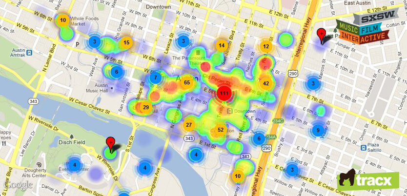
Tracx customers have access to an interactive map showing clusters of public, location-tagged user-generated content (tweets, check-ins, etc.) that are relevant to their campaigns, with the ability to drill down to the individual post level.